Showing posts with label subconscious. Show all posts

Friday, 25 July 2014

The Colours BLUE & INDIGO

In the Colour Energy Course that I attended last year, we did an in-depth exploration into each spectral colour. Each week we focused on a particular colour and it's associated energy Chakra. We explored the colour's energy through senses, meditation and painting using only the tones and hues of that colour.
 
For each class we were asked to dress in the colour we were exploring that week. A still life, made up of various objects in the colour was set up in the studio. Little bottles of essential oils associated with that Chakra and colour were set out on a tray for us to smell. Even the food and drink that we had during our tea break was in the colour we were exploring.


The Colours BLUE & INDIGO

I have been struggling to write this post about Blue and Indigo. This session was a very emotional one for me. It left me questioning many things... I've been struggling to find the words...

We combined the Blue (Throat Chakra) and Indigo (Brow Chakra) sessions because when mixing paints in various shades and tones of Blue and Indigo there is an overlap in the colours, Indigo being a dark blue reaching towards purple.

The still life was beautiful as always. It made the studio feel cool, calm and relaxing. If you closed your eyes you could imagine walking through a gentle mist, or into the darkness of the night. Some blue shades could leave you feeling a little sad or 'blue' however.


We sat around the still life soaking in the colours and smelling essential oils like Cypress, Eucalyptus, Myrrh, Patchouli, Pine, Geranium and Peppermint.
We then mixed up our paint, making six different shades and tones of Blue and Indigo.
 
After our meditation I started off by painting quite calmly, covering the canvas paper with lovely teal and light turquoise paint. When I started adding the darker shades (Indigo) my brushstrokes became more frenetic. I then, rather energetically, added all the shades I'd mixed, creating a lot of texture and movement on the page. I grabbed the wooden printing blocks and a plastic scourer and continued to add even more texture onto the canvas. I was working freely and loosely, with intuitive spontaneity, just as we were meant to.
 
Texture added using the wooden printing blocks
 
After our tea break, it was time to take a look and see if my painting had anything to 'reveal'. I saw a face and a seahorse. They didn't make a very good composition so I turned the page 90 degrees. And again. And again. And again. I had to then remind myself that this wasn't about a pretty picture with a carefully considered layout and composition. I needed to paint what I saw. So that is what I did.
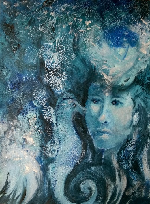
My final painting
 
 
At the end of the session we did another meditation. We had been given a piece of paper and were asked to write, without thought or hesitation, the first thing that came to our mind. Like a message from the universe.
 
I wrote: "Meet me down at the bottom of the deep blue sea."
 
We then had to go around the class and, stopping at each person's work, do the same for them. So without thought or hesitation we wrote the first thing that came to mind when we sat in front of their painting.
The messages that had been left for me by my classmates were:
"Holy Communion"
"Beauty and serenity can be found"
"Looking intensely"
and "Serene beauty - your spirit guide"
 
We took turns to share our 'messages' with the class. One person said that my "spirit guide" made her think of the clay sculpture I'd made in my first Astar class 9 months earlier. As she said it, I experienced a wave of emotion and could not hold back the tears. (It was rather embarrassing, I must say)
My clay sculpture had been about a dear friend who had gone missing at sea in March 2010. His boat and his dog, who was still alive, had been found two weeks later but he was not on board.
 
Detail of the seahorse
 
When I got home that evening I did an internet search to find the symbolic meaning of a seahorse.
This is what I found:

"The seahorse is thought to have mystical significance among the Ancient Greeks, Europeans and Asians. The Ancient Greeks and Romans believed the seahorse was an attribute of the sea god Neptune and as such, the seahorse was considered a symbol of strength and power."
"Chinese cultures believed that the seahorse was a type of sea dragon, and as such they were revered for their power and thought to be symbols of good luck. Sailors have long viewed the seahorse as a good luck charm too." (source)
 
And then I read this, and my tears returned...
 
"The ancient Eurpeans believed that the seahorse carried the souls of deceased sailors to the underworld - giving them safe passage and protection until they met their soul's destination."
 
 
Blue is the colour associated with the fifth Chakra, the Throat Chakra. It deals with issues of communication, expressing our own personal truth, creative expression and symbolic thinking.
 
The colour Indigo is associated with the sixth Chakra, the Brow Chakra. It is also often referred to as the third eye or the mind center. As the 'source' or center of psychic knowledge, this Chakra produces our Dreams and Fantasies, as well as such advanced psychic states as Clairvoyance, Telepathy, Clairaudience and Spirit Communication.
 
 
xxx For Paul. In loving memory. xxx

Wednesday, 18 June 2014

The Colour GREEN


In the Colour Energy Course that I attended last year, we did an in-depth exploration into each spectral colour. Each week we focused on a particular colour and it's associated energy Chakra. We explored the colour's energy through senses, meditation and painting using only the tones and hues of that colour.
 
For each class we were asked to dress in the colour we were exploring that week. A still life, made up of various objects in the colour was set up in the studio. Little bottles of essential oils associated with that Chakra and colour were set out on a tray for us to smell. Even the food and drink that we had during our tea break was in the colour we were exploring.

The Colour GREEN


Once again, the still life that had been set up in the studio was absolutely beautiful. It made me feel relaxed and at peace. I had a strong urge to disappear into a forest or somewhere where I'd be surrounded by nature.
Of the lovely essential oils that we smelled, Clove, Lavender, Sandalwood, Rose, Cedar Wood, Peppermint, Basil, Geranium and Pine, Peppermint was my favourite.
 
We sat quietly around the still life soaking in the colour green. 
After a short meditation, we mixed up our paints in six different tones and shades of green and began to paint. 
I applied a base coat to my canvas paper and then found myself painting many wavy lines in various shades and tones. They soon began to look like blades of grass. I painted a circular shape in a lighter green, almost like a sun. The blades of grass seemed to all reach up to it. I grabbed a couple of the wooden printing blocks that I love. One of them looked a bit like a flower, so I started stamping flowers onto the page. I felt like I was lying in a field of flowers looking up at the sky. In my mind a white butterfly fluttered by. So I painted it in. 


My painting of the colour green.
 
Detail added with the wooden printing blocks that I love so much.
 
At first I wasn't sure how my painting related to the Heart Chakra at all. Was it the butterflies in your tummy when you fall in love? Flowers given as a romantic gesture? It seemed a bit silly. So I took time to read up about the Heart Chakra and the symbolic meaning of butterflies.

A butterfly is most often associated with symbolism of change and powerful transformations. Elevation from earthly matters, turning into emotional or spiritual.

In many cultures the butterfly is a symbol of the soul or soul world. For the Japanese, a white butterfly symbolises the soul of the departed ones.
 
In Greek mythology, Psyche (meaning "soul") was often depicted as a butterfly winged goddess. She was linked with love as she shared an endlessly passionate bond with Eros, the god of love.

Green is the colour associated with the fourth Chakra, the Heart Chakra, also known as Anahata.
It is located in the heart and chest area. The purpose of the Heart Chakra is to give love, to receive love and to find balance. It deals with issues of self-love, relationships, intimacy and devotion.

This fourth Chakra is also the middle point of the seven chakra system.
It acts as a bridge between the lower three Chakras which deal with the physical world (earthly matters), and the higher three chakras which are to do with expression and spirituality (soul).

So it seems that my painting does in fact tie in with, and illustrate the purpose of, the Heart Chakra quite nicely. :)


Links to my blog posts about colour: RED  ORANGE  YELLOW GREEN BLUE&INDIGO VIOLET

Thursday, 22 May 2014

The Colour ORANGE

In the Colour Energy Course that I attended last year, we did an in-depth exploration into each spectral colour. Each week we focused on a particular colour and it's associated energy Chakra. We explored the colour's energy through senses, meditation and painting using only the tones and hues of that colour.

For each class we were asked to dress in the colour we were exploring that week. A still life, made up of various objects in the colour was set up in the studio. Little bottles of essential oils associated with that Chakra and colour were set out on a tray for us to smell. Even the food and drink that we had during our tea break was in the colour we were exploring.

In the second week we explored the colour ORANGE.


The carefully put together still life of various objects in shades and tones of orange was once again breath-taking. We sat around the still life soaking in the colour and smelling essential oils like Geranium, Cinnamon, Mandarin, Ylang Ylang, Clary Sage, Jasmine and Sandalwood. I used to love the colour orange, and still like it, but not as much. On this day it made me feel warm and inspired. There were a couple of people in the class who absolutely hated it.
 
After mixing up paint in six shades and tones of Orange and a short meditation, we began to paint with 'intuitive spontaneity'. I covered my entire canvas sheet with a medium shade of orange, and then found myself painting bright flames dancing up the page. These flames soon turned into a swirling mess which then transformed into what looked like the close up of a peach that had been sliced in half to reveal the pip in the middle.
The peach pip then transformed into the belly of a pregnant woman.


I made a decision at the start of this course not to refresh my memory by reading up on the different colours and Chakras. I had learnt a bit about chakras many (more than 7) years ago when I practised yoga, but could not remember exactly what each Chakra or colour was associated with.
Needless to say I was pleased to see (but not completely surprised) that my end result did in fact tie in with the colour orange and the associated Chakra, the second Chakra.
 
The second Chakra, also known as your Sacral Chakra or Swadhisthana, is located about 2 inches below your belly button. It is the seat of emotions and deals with issues of self-worth, creativity, relationships, empathy, nurturing, movement, change, pleasure and sexuality. The associated body parts are the hips, lower back, sexual organs, bladder, kidneys and bodily fluids.

For interest's sake I also looked up the significance and meaning of the peach. As it turns out, in eastern mythology the Peach is a symbol of immortality, female sexuality and fertility. :)
I also came across a Japanese Folklore tale about Momotarō, a boy who was born out of a peach. 


Links to my blog posts about colour: RED  ORANGE  YELLOW


Wednesday, 14 May 2014

The Colour RED

In the Colour Energy Course that I attended last year, we did an in-depth exploration into each spectral colour. Each week we focused on a particular colour and it's associated energy Chakra. We explored the colour's energy through senses, meditation and painting using only the tones and hues of that colour.

For each class we were asked to dress in the colour we were exploring that week. A still life, made up of various objects in the colour was set up in the studio. Little bottles of essential oils associated with that Chakra and colour were set out on a tray for us to smell. Even the food and drink that we had during our tea break was in the colour we were exploring.

We started with the colour RED.

Red governs the Base Chakra, also known as the Root Chakra or Muladhara, which is situated at the base of the spine. It is associated with basic survival, grounding, security (financial, career, home, physical safety, basic needs), vitality, stability and courage.

When we entered the studio on this day the sight that greeted us took my breath away. Red is my favourite colour and the beautiful and carefully put together still life had me in awe. I felt warm and energised.


It was interesting to witness other peoples reactions to this strong and energetic colour. There were only two of us that loved it. The others found the colour overwhelming. Dizzying.
 
We sat around the still life soaking in the colour, observing the various shades and tones of red.
We smelled essential oils like Cedar, Patchouli, Frankincense and Myrrh.
We then mixed up some paint making six different shades and tones of Red.
During the meditation I kept seeing images of a younger me, energetic, fit and healthy, riding my bicycle in foreign lands. :)
When we began to cover our canvas paper with paint I started to panic. I didn't know where I was going. It felt like I was making a big mess. The idea was to paint with intuitive spontaneity. I do find it hard to work freely and loosely without trying to paint a 'picture' or anything in particular. I used an Indian textile printing block (I LOVE them) as well as some bubble wrap and a piece of plastic mesh to apply paint and add texture to my page.
  
Marks made using an Indian textile printing block.
 
After our tea break we had a look to see if any shapes or figures were emerging from our work. I turned my page 90 degrees, 180 degrees, 270 degrees and then back to the way it was. Nothing.
It was only when we had about 10 minutes left to paint that I saw the shape of a snake's head appear. The texture that I'd created with the plastic mesh and bubble wrap looked a lot like snakeskin.
I have always believed that I can't draw from my imagination but in this instance, with no reference pictures of snakes available,  I had no choice. I closed my eyes and tried to picture a snake curled up and raising its head. I wasn't sure which way a snake curled, inward or outward, so I just painted what I saw in my picture by adding a few shadows here and there.
 
'Snakeskin' texture created by applying the paint with a piece of bubble wrap and a piece of plastic mesh.
 
My final painting. A RED snake.
 
 
As I sat looking at my painting, I remembered that a coiled, sleeping serpent was the symbol of the Kundalini - the latent female energy believed to lie coiled at the base of the spine. It was something I'd learnt about many years ago when I practised Yoga regularly.
I immediately thought, "How predictable. How obvious. How contrived."
But thoughts of a serpent, Yoga or Kundalini hadn't entered my mind while I was painting. It wasn't something I'd purposefully done. It really was the result of painting freely, intuitively and spontaneously.
The other thing about my painting was that the serpent was not sleeping.
It had been awakened from its slumber. ;)
 

About Kundalini Energy:

"Kundalini is a dormant energy within most people.
In Hindu mythology, Kundalini is a serpent goddess who lies asleep at the base of the spine, coiled three and a half times around the first chakra.Her name is Kundalini Shakti, and she represents the unfolding of the divine Shakti energy, the energizing potential of life itself, a living goddess who enlivens all things.
Under certain circumstances, the Kundalini energy awakens and begins to rise through the body, piercing and opening the chakras as she moves in her undulating, snake-like fashion. As Kundalini releases stored and blocked energies, her movement can be quite intense, sometimes painful, and often leads to mental states that seem out of this world.
Circumstances that stimulate Kundalini awakening are many and varied, but are usually triggered by such things as extended periods of meditation, yoga, fasting, stress, trauma, psychedelic drugs, or near death experiences."
Source: http://www.reiki-for-holistic-health.com/kundaliniawakening.html


Links to my blog posts about colour: RED  ORANGE  YELLOW


Wednesday, 23 October 2013

Self Portrait

The project in one of my process art classes a few months ago, was to do a series of Self Portraits using clay, charcoal, and tea, coffee and ink.

For the first one we were given a mirror and a large lump of clay.
Sitting comfortably and holding the clay in our hands, we did a guided meditation.
We then placed the clay on the desk in front of us and with our eyes closed, were instructed to carefully and slowly feel our face, ... our ears, ... our head ... and our neck. We did this a few times using both our hands, first our fingertips and then our whole hand.
When we were done, we started to mould the ball of clay into a self portrait. We could look at our refection in the mirror and at times we closed our eyes and worked intuitively, feeling our way around the clay and occasionally referring back by feeling our faces and heads with our hands.

You would think that with all this care taken to explore your own face, and to carefully mould it out of clay, you would manage to achieve a pretty close resemblance of yourself  in your final sculpture.

So, I ask you, with tears in my eyes...

Who the hell is THIS Guy !??   LOL


Self Portrait in clay

Self Portrait in clay - side view


Charcoal sketch of Self Portrait in clay


Self Portrait in charcoal


Self Portrait - wet on wet using tea, coffee and black ink


Wednesday, 18 September 2013

Geisha

During the second term of my process art classes, the focus was very much on letting go of your inner critic. It was about surrendering to the process and not worrying about or planning the end result. This was done in a number of ways, from passing your work around the class where each student got to add something to your work, to working with a blindfold on.
 
In this class we prepared pages of rubbings, blindfolded. We chose various textured or patterned objects beforehand that could be rubbed over with wax crayon. We worked quickly and filled each page without much thought given to what we were doing.

The pages looked something like this:
 
Page of rubbings done with wax crayon.
 
Once we'd filled a number of pages with texture, we lay them out on the floor and were asked to choose one that "spoke" to us. One that seemed to have a hidden image.
 
I unfortunately don't have a photo of what my chosen page looked like before I worked into it with tea bags and inks.
I saw the outline of a woman's face with her hair pinned up. She had a thin elegant neck and her eyes (the birds) had luscious false eye lashes. I darkened the background with a wash of black ink to bring her out into the light.

The final artwork called Geisha

Detail of the face with the 'bird eyes'

Another detail of the artwork 'Geisha'
 

The week before I did this artwork, I bought a pair of false eye lashes made from feathers for a friend. She was going to Afrika Burn and I thought they would be a great accessory to add to her fancy dress outfits. Of course I wasn't thinking of the false eyelashes at the time of creating this artwork.
 
When I looked at the woman in my final work, the name 'Geisha' immediately sprung to mind even though she does not look Japanese or have black hair.
The term "geisha" is made of two Japanese words, (gei) meaning "art" and (sha) meaning "person who does" or "to be employed in".
 
The most literal translation of geisha to English is "artist".
 
Well, I suppose I am a "Geisha" in training. :)


Thursday, 15 August 2013

Full Moon Love Mandala


Back in April this year I was driving to art class in the direction of a giant, rising, full moon. The traffic was slow and every traffic light that I came to was red, so I had plenty of time to gaze in awe at how beautiful it was.
 
Coincidence and synchronicity have become very much part of my experience at my weekly process art classes. I have almost come to expect there to be some sort of coincidence. So when I arrived at class and found a large circular (full moon shaped) piece of paper on my desk, I simply gave a quiet little "huh".
 
We were going to do mandalas. (Mandala comes from Sanskrit meaning "circle.")
We started off, after a guided meditation, paging through magazines and tearing out pages that resonated with us. A smaller circle had been drawn in pencil in the middle of our paper. We collaged some of our magazine pictures into this smaller circle.
 
But THEN, the class took a whole new direction! We were instructed to pass our work to the person next to us, and in so doing we received someone else's work. We were then given a few minutes to add something to the work in front of us, using magazine pictures or ink. We passed each work around the class, stopping to add something to each person's work.
By the time your original work came back to you, it had taken on a new life and may have gone in a totally different direction to what you had "planned". (shock horror!) Which was precisely the reason for the exercise. You are not supposed to plan your work in these classes. It was a good way to force you to LET GO and to not be too precious about the outcome of your work.
 
The "gifts" I'd received on my mandala by the time it reached my desk again where lovely.
Someone had divided my page up with some ink lines which made me think of a clock. Time.
Someone else had painted an ink heart. Others had added magazine eyes, a picture of a fig, a stick like figure and star shape.
Funnily enough, the magazine pictures that I'd torn out at the beginning of the session, and later added to my mandala, worked very well with what had been added to my page by others.
My end result included many hearts, Cupid's arrows, men making eyes at and flirting with voluptuous women, rock paintings, two stags with locked horns and two Greek stamps with a picture of a centaur, the symbol for the zodiac sign of Sagittarius.
 
 
I made this mandala a few days after spending a lovely "date day" with my Sagittarius husband.
(I posted some pictures from that day here.)  I called it "Full Moon Love Mandala".
We have 3 young children who keep us very busy and we hadn't spent quality time together, just the two of us, in a really long time. Our "date day" felt a bit like starting from the beginning again. Courting. Flirting. Falling in love.

Wednesday, 24 July 2013

Collage work - Process Art classes

Earlier this year, in the fourth Process Art class that I attended, we were required to do a collage using pictures from magazines.

We started off (with the help of a guided meditation) by writing about a memory from our childhood to do with a book or story that someone had read to us or told us.
Mine was 'Goldilocks and the Three Bears'. I used to have a recurring bad dream about that story when I was little. In my dream the bears were at our front gate, coming for me, and I had nowhere to hide and nowhere to run to. I felt such fear of getting into trouble for doing something I'd been told not to do.

We paged through magazines and tore out pictures that caught out attention and resonated with us, not necessarily pictures that illustrated the story.
I was never a huge fan of collage work and found it hard to get into. I did not enjoy the class that much. I was also disappointed with my work at the end of the lesson.
In those early days of Process Art classes I was still hung up on the final artwork or end result and hadn't quite got into the 'process' yet.

The collage that I did in one of the first Process Art classes.

A month later, we did another collage. This time we started with wax crayons, inks and bleach before paging through the magazines and tearing out pictures to paste onto our work. Amazingly, I thoroughly enjoyed myself. I was completely unconcerned about what the end result would look like. I was actually humming happily (but very quietly) while I worked. I was surprised at the end result but this time did not focus on it as an 'artwork' or place any judgement or criticism onto it.

The collage that I did a month after the first collage.

At the end of that term we were given all our work back in a large brown folder. I laid my work out on the floor to get a good look at what I had achieved and it immediately struck me that these two collages had strong similarities.

All the work done during the first term of my Process Art classes.
From top left: Guardian Figure, Flower - Symbol, Silenced Love, Gateway, Flow, Immerse Yourself, Creative Block, Untitled


The Two collages:


Both collages have a path leading to an open doorway positioned more or less in the middle of the picture.
At the start of the pathway in the first collage, is a jumble of torn pieces from a picture of dried autumn leaves. They look a lot like flames.
In the second collage there is the shape of a lotus flower made up of petals cut from a picture of flames.
In the first there are rays of light coming into the picture and in the second there are rays going out from the centre of the page.

While doing the first collage I felt stuck, frustrated and irritable. While doing the second one I felt free and full of joy!
I can read a lot more into both of these works, but for me the most exciting thing is the idea (or even the proof) that my subconscious is hard at work during these Process Art classes.

A friend asked me what it is that I gain from doing these classes. What 'therapy' am I getting from them?

I think what it is, is that I'm giving my subconscious a voice.
 A bit like analysing ones dreams?
A way to feel connected to something greater.