Thursday, 22 May 2014

The Colour ORANGE

In the Colour Energy Course that I attended last year, we did an in-depth exploration into each spectral colour. Each week we focused on a particular colour and it's associated energy Chakra. We explored the colour's energy through senses, meditation and painting using only the tones and hues of that colour.

For each class we were asked to dress in the colour we were exploring that week. A still life, made up of various objects in the colour was set up in the studio. Little bottles of essential oils associated with that Chakra and colour were set out on a tray for us to smell. Even the food and drink that we had during our tea break was in the colour we were exploring.

In the second week we explored the colour ORANGE.


The carefully put together still life of various objects in shades and tones of orange was once again breath-taking. We sat around the still life soaking in the colour and smelling essential oils like Geranium, Cinnamon, Mandarin, Ylang Ylang, Clary Sage, Jasmine and Sandalwood. I used to love the colour orange, and still like it, but not as much. On this day it made me feel warm and inspired. There were a couple of people in the class who absolutely hated it.
 
After mixing up paint in six shades and tones of Orange and a short meditation, we began to paint with 'intuitive spontaneity'. I covered my entire canvas sheet with a medium shade of orange, and then found myself painting bright flames dancing up the page. These flames soon turned into a swirling mess which then transformed into what looked like the close up of a peach that had been sliced in half to reveal the pip in the middle.
The peach pip then transformed into the belly of a pregnant woman.


I made a decision at the start of this course not to refresh my memory by reading up on the different colours and Chakras. I had learnt a bit about chakras many (more than 7) years ago when I practised yoga, but could not remember exactly what each Chakra or colour was associated with.
Needless to say I was pleased to see (but not completely surprised) that my end result did in fact tie in with the colour orange and the associated Chakra, the second Chakra.
 
The second Chakra, also known as your Sacral Chakra or Swadhisthana, is located about 2 inches below your belly button. It is the seat of emotions and deals with issues of self-worth, creativity, relationships, empathy, nurturing, movement, change, pleasure and sexuality. The associated body parts are the hips, lower back, sexual organs, bladder, kidneys and bodily fluids.

For interest's sake I also looked up the significance and meaning of the peach. As it turns out, in eastern mythology the Peach is a symbol of immortality, female sexuality and fertility. :)
I also came across a Japanese Folklore tale about Momotarō, a boy who was born out of a peach. 


Links to my blog posts about colour: RED  ORANGE  YELLOW


Wednesday, 14 May 2014

The Colour RED

In the Colour Energy Course that I attended last year, we did an in-depth exploration into each spectral colour. Each week we focused on a particular colour and it's associated energy Chakra. We explored the colour's energy through senses, meditation and painting using only the tones and hues of that colour.

For each class we were asked to dress in the colour we were exploring that week. A still life, made up of various objects in the colour was set up in the studio. Little bottles of essential oils associated with that Chakra and colour were set out on a tray for us to smell. Even the food and drink that we had during our tea break was in the colour we were exploring.

We started with the colour RED.

Red governs the Base Chakra, also known as the Root Chakra or Muladhara, which is situated at the base of the spine. It is associated with basic survival, grounding, security (financial, career, home, physical safety, basic needs), vitality, stability and courage.

When we entered the studio on this day the sight that greeted us took my breath away. Red is my favourite colour and the beautiful and carefully put together still life had me in awe. I felt warm and energised.


It was interesting to witness other peoples reactions to this strong and energetic colour. There were only two of us that loved it. The others found the colour overwhelming. Dizzying.
 
We sat around the still life soaking in the colour, observing the various shades and tones of red.
We smelled essential oils like Cedar, Patchouli, Frankincense and Myrrh.
We then mixed up some paint making six different shades and tones of Red.
During the meditation I kept seeing images of a younger me, energetic, fit and healthy, riding my bicycle in foreign lands. :)
When we began to cover our canvas paper with paint I started to panic. I didn't know where I was going. It felt like I was making a big mess. The idea was to paint with intuitive spontaneity. I do find it hard to work freely and loosely without trying to paint a 'picture' or anything in particular. I used an Indian textile printing block (I LOVE them) as well as some bubble wrap and a piece of plastic mesh to apply paint and add texture to my page.
  
Marks made using an Indian textile printing block.
 
After our tea break we had a look to see if any shapes or figures were emerging from our work. I turned my page 90 degrees, 180 degrees, 270 degrees and then back to the way it was. Nothing.
It was only when we had about 10 minutes left to paint that I saw the shape of a snake's head appear. The texture that I'd created with the plastic mesh and bubble wrap looked a lot like snakeskin.
I have always believed that I can't draw from my imagination but in this instance, with no reference pictures of snakes available,  I had no choice. I closed my eyes and tried to picture a snake curled up and raising its head. I wasn't sure which way a snake curled, inward or outward, so I just painted what I saw in my picture by adding a few shadows here and there.
 
'Snakeskin' texture created by applying the paint with a piece of bubble wrap and a piece of plastic mesh.
 
My final painting. A RED snake.
 
 
As I sat looking at my painting, I remembered that a coiled, sleeping serpent was the symbol of the Kundalini - the latent female energy believed to lie coiled at the base of the spine. It was something I'd learnt about many years ago when I practised Yoga regularly.
I immediately thought, "How predictable. How obvious. How contrived."
But thoughts of a serpent, Yoga or Kundalini hadn't entered my mind while I was painting. It wasn't something I'd purposefully done. It really was the result of painting freely, intuitively and spontaneously.
The other thing about my painting was that the serpent was not sleeping.
It had been awakened from its slumber. ;)
 

About Kundalini Energy:

"Kundalini is a dormant energy within most people.
In Hindu mythology, Kundalini is a serpent goddess who lies asleep at the base of the spine, coiled three and a half times around the first chakra.Her name is Kundalini Shakti, and she represents the unfolding of the divine Shakti energy, the energizing potential of life itself, a living goddess who enlivens all things.
Under certain circumstances, the Kundalini energy awakens and begins to rise through the body, piercing and opening the chakras as she moves in her undulating, snake-like fashion. As Kundalini releases stored and blocked energies, her movement can be quite intense, sometimes painful, and often leads to mental states that seem out of this world.
Circumstances that stimulate Kundalini awakening are many and varied, but are usually triggered by such things as extended periods of meditation, yoga, fasting, stress, trauma, psychedelic drugs, or near death experiences."
Source: http://www.reiki-for-holistic-health.com/kundaliniawakening.html


Links to my blog posts about colour: RED  ORANGE  YELLOW


Thursday, 24 April 2014

Colour Energy Course

I love coincidences and synchronicity.
I've just come across one of my old forgotten notebooks from 2006. In it I'd written down some ideas and made rough sketches for paintings and other creative projects that I wanted to do. One of the ideas was to do paintings of the SEVEN Chakras, each one in the colour associated with that Chakra.
(I never took the idea any further at the time.)

My forgotten notebook from 2006

 
And what do you know!!!
We recently did exactly that in my process art classes! SEVEN years later!!
I've been falling behind on my blog and am finding that the longer I leave it the harder it becomes to start writing again. Finding this old notebook has given me a “kick up the butt” and inspired me to get back to it :) So here goes...

 
COLOUR ENERGY COURSE:
 
The flyer advertising the ASTAR Colour Energy Course
 
"Colour is a form of energy that has the power to affect us physically, emotionally and mentally. Our use of colour expresses how we feel and think. The colours we surround ourselves with can have a huge effect on our mood. Colour can raise spirits and self-esteem, enhance surroundings, reduce stress and help view life more positively.
 
In the Colour Energy Course we will devote a three-hour in-depth exploration into each spectral colour, exploring the colour's energy through senses, meditation and painting only in the tones and associated hues of that colour.
Each week we focus on a particular colour, moving through the Chakra system, painting with intuitive spontaneity. We explore the colour nuances where, week by week, you are encouraged to integrate each colour into your daily lives.
 
This wholistic experience of each colour is a unique and very exciting journey."
- from the flyer advertising the ASTAR Colour Energy Course
 
 
I did the ASTAR Colour Energy Course at the end of last year (2013).
I was very excited to take part in the course because I'd had an interest in colour energy and the chakra system in the past and was keen to find out more.
The course helped me to reconnected with a part of myself that I seemed to have left behind somewhere along the way. Our home used to be filled with colour, but it was also full of clutter. In an attempt to de-clutter our space and to make it less busy I replaced colour with, what I thought would be, calming neutrals and a lot of white. There was also a trend at the time to have All White, minimalist interiors. I never got the minimalist thing right. My hubbie and I just collect too much STUFF!
Doing the course has made me fall in love with colour all over again. Even colours that I was not keen on before, like yellow and purple, now excite and inspire me.
The course also ended up being more profound than I'd ever imagined it would be.
All in all, I LOVED it!
...

Links to my blog posts about colour: RED  ORANGE  YELLOW

Monday, 10 March 2014

Knight's Castle - made from recycled boxes

One day, driving home after a play date, my son (then 5yrs old) told me that he would LOVE to have a Knight's Castle like the one his friend has. (It is a large, impressive plastic castle with all the accessories)

Christmas was only a couple of months away so I suggested that he include it in his letter to Santa. After a thoughtful moment he said excitedly "Or I can MAKE one!!".
Which he then did the following day (with a little help from mom).
I was delighted, and so proud of him.


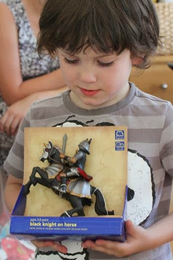
He then wrote a letter to Santa and asked for a Knight (or two) on horseback.
And Santa delivered :)


Wednesday, 20 November 2013

Origami Window Stars


 I fell in love with some paper stars that were stuck up in the window at art class this week.
When I got home I did an Internet search to find instructions on how to make them.

It is suggested that you use tissue paper or kite paper (which is said to be better).
I didn't have either but couldn't wait to make one, so I used some trace that I tore out of a paper sample catalogue I had in my paper stash.

 
Instructions for this basic star can be found on the Duo Fiberworks website.


I think they would make lovely Christmas decorations.
I'm itching to make more and to try different designs, sizes, papers and colours but I have some work that needs to be done first. :)

Wednesday, 23 October 2013

Self Portrait

The project in one of my process art classes a few months ago, was to do a series of Self Portraits using clay, charcoal, and tea, coffee and ink.

For the first one we were given a mirror and a large lump of clay.
Sitting comfortably and holding the clay in our hands, we did a guided meditation.
We then placed the clay on the desk in front of us and with our eyes closed, were instructed to carefully and slowly feel our face, ... our ears, ... our head ... and our neck. We did this a few times using both our hands, first our fingertips and then our whole hand.
When we were done, we started to mould the ball of clay into a self portrait. We could look at our refection in the mirror and at times we closed our eyes and worked intuitively, feeling our way around the clay and occasionally referring back by feeling our faces and heads with our hands.

You would think that with all this care taken to explore your own face, and to carefully mould it out of clay, you would manage to achieve a pretty close resemblance of yourself  in your final sculpture.

So, I ask you, with tears in my eyes...

Who the hell is THIS Guy !??   LOL


Self Portrait in clay

Self Portrait in clay - side view


Charcoal sketch of Self Portrait in clay


Self Portrait in charcoal


Self Portrait - wet on wet using tea, coffee and black ink


Wednesday, 2 October 2013

Last Dance - mono prints

Printmaking (or Graphics as it was called) was my favourite subject when I was in high school. I've done the odd etching, woodcut and lino cut over the years and have always dreamt of one day having my own press. It is therefore not surprising that my favourite Process Art classes have become the ones where we work with Mono prints.
 
The class started with a guided meditation, which I always find really helpful. It calms your mind and helps you to switch off, or change gear, after a busy day.
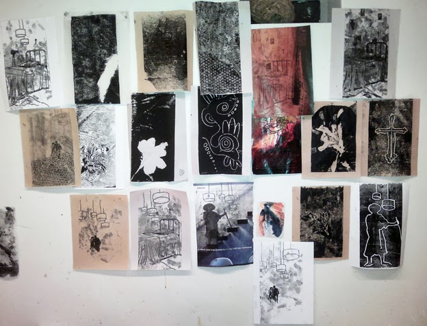
We spent some time paging through magazines and tearing out pages of colour, texture or images that grabbed our attention. There was also a selection of items such as bubble wrap, textured fabric, lace, flowers, leaves etc. that could be used to make texture or patterns in the ink. We were free to experiment printing onto different papers, including the magazine pages we'd torn out.
 
 
My many printing experiments done on various papers, including some magazine pages.
 
 
When we were done, we stuck all our prints up on the wall and quietly sat and looked at them. We were to choose two prints that could then be worked into by adding colour with ink or pastels.
 
These were the two prints that stood out for me. They felt like they belonged together.
 
 
Last Dance
 
 
As always, the artwork that I do in these classes ends up reflecting something that is on my mind or in my subconscious at the time. In the days before this class I had been thinking and worrying a lot about my father who is ill and was due to start radiation therapy. I had been preoccupied by thoughts of human mortality, the fear of death, and the fear of, and inevitability of, one day losing my parents.
 
I called this work "Last Dance".